|
|
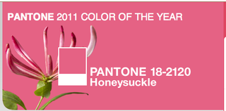
 This is the sort of job I wonder about sometimes. How does one become the person who selects the color of the year? Leatrice Eiseman, executive director of the Pantone Color Institute® must know — as her organization has declared Honeysuckle the 2011 color of the year.
Here's what Pantone had to say about the selection:
A Color for All Seasons. Courageous. Confident. Vital.
A brave new color, for a brave new world.
Let the bold spirit of Honeysuckle infuse you, lift you and carry you through the year. It’s a color for every day – with nothing “everyday” about it. While the 2010 color of the year, PANTONE 15-5519 Turquoise, served as an escape for many, Honeysuckle emboldens us to face everyday troubles with verve and vigor.
A dynamic reddish pink, Honeysuckle is encouraging and uplifting. It elevates our psyche beyond escape, instilling the confidence, courage and spirit to meet the exhaustive challenges that have become part of everyday life.
“In times of stress, we need something to lift our spirits. Honeysuckle is a captivating, stimulating color that gets the adrenaline going – perfect to ward off the blues,” explains Leatrice Eiseman, executive director of the Pantone Color Institute®. “Honeysuckle derives its positive qualities from a powerful bond to its mother color red, the most physical, viscerally alive hue in the spectrum.”Eiseman continues, “The intensity of this festive reddish pink allures and engages. In fact, this color, not the sweet fragrance of the flower blossoms for which it was named, is what attracts hummingbirds to nectar. Honeysuckle may also bring a wave of nostalgia for its associated delicious scent reminiscent of the carefree days of spring and summer.”
Honeysuckle is guaranteed to produce a healthy glow when worn by both men and women. It’s a striking, eye-catching hue that works well for day and night in women’s apparel, accessories and cosmetics, and in men’s ties, shirts and sportswear.
Add a lively flair to interior spaces with Honeysuckle patterned pillows, bedspreads, small appliances and tabletop accessories.
Looking for an inexpensive way to perk up your home? Paint a wall in Honeysuckle for a dynamic burst of energy in the family room, kitchen or hallway.
Hmm. Apparently I am more of a 2010 kind of guy. I'll go with the turquoise, thank you. Pretty sure you will not see any honeysuckle shirts hanging in my closet. But…and here's the actual marketing point: it doesn't matter if I don't like it.
All too often, marketers allow their personal opinions color (pun intended) how they create marketing tools for clients. All of us need to be very wary of allowing these sorts of decisions to be subjective. There should be a reason why you choose a particular font, color, headline or visual.
And the reason should not be "because I like it."


That colour, what it will bring to us, reminds me of what I read about what the Year of the Rabit (Chinese Year for 2011) will bring us:
http://tinyurl.com/36sn3pd – item 2 in our newsletter 😉 (Yeap, marketing the good feelings to will come our way next year)
Karin H
I’m not sure how Honeysuckle is going to be very used by many people. I’m with you on the turquoise! Good point about marketers not allowing their opinions about color affect what they use for their clients’ marketing or branding.
PS. You won’t see me using Honeysuckle anywhere either!
Karen,
I’ll be sad to say goodbye to the Year of the Tiger. But I’m all for hope and optimism!
Drew
Cyndi,
It will be interesting to see how people incorporate the color. It seems a bit WOW to me for many applications. But what do I know?
Drew
I’m not changing my branding for anyone. If turquoise is last year, then so am I. Ick, pink has been overused and abused by women in business reasons for years!
When in the heck did honeysuckle become pink? I think of honeysuckle as a wonderfully warm yellow….
Laynie,
I don’t think Pantone was suggesting that if your brand color was blue, it should suddenly become honeysuckle. I think it’s more of a “what color will be hot/popular this year” than a “everyone should adopt” sort of thing.
So have no fear — you’re safe!
Drew
Pam,
You know better than to ask ME that question!
Drew
I think the thing to remember is that — this isn’t really about whether or not we personally like it or if we’d consider changing our brand color to it. Instead, it’s an indication of a color trend and increased usage.
As marketers we have to be careful not to inject our opinions into marketing decisions! No small task!
Drew
Danny,
I’m not so sure I think it’s ridiculous. I do think too many people will drift away from the point of the announcement.
Again — it’s not saying everyone should use this color but instead to understand the trend and why the color will be popular. In that discovery, there are marketing insights and a ha moments!
Drew