|
|
I can’t draw a stick person by hand or on the computer. So I have always marveled at people who can really take design to a different level and go beyond pretty/cool to smart. That’s what brilliant logo designers do.
I thought you’d enjoy checking out some of these very smart logo designs.

If you look at the center of this logo, you can see two people enjoying a Tostito chip with a bowl of salsa. Great logos often have layers to them.
![]()
Like the FedEx logo. Do you see the “hidden” arrow within the logo? Look at the space between the E and the x.
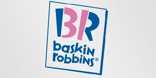
This is the new Baskin Robbins logo. The old one had the number 31 with an arc above it. See how they’ve incorporated the 31 in the new design?

See the number 1 in the negative space between the F and the red stripes? Notice how the red section communicates a feeling of speed.
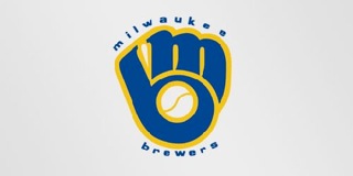
By now, you should be getting good at spotting the layers. Do you see the M and the B?

Two elements to notice in this simple logo. The yellow arrow connects the A to the Z (we have everything from A-Z) and forms a smile, to connote a commitment to customer service.
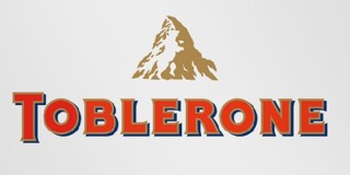
Toblerone is a chocolate company from Bern, Switzerland which is sometimes called The City Of Bears. Do you see the silhouette of a bear?
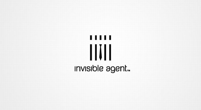
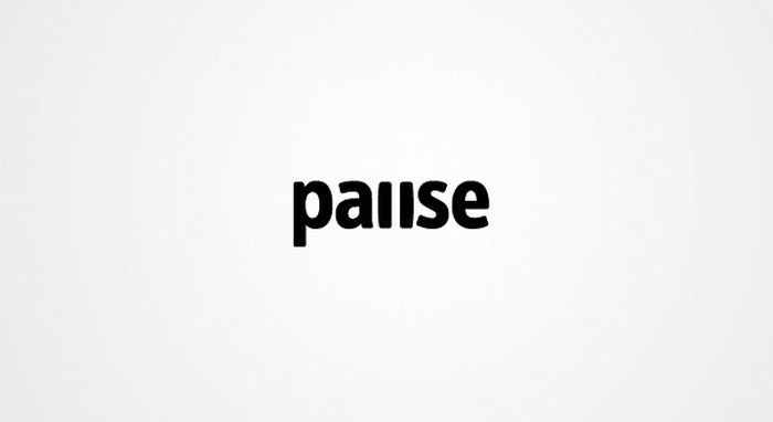
Okay…here are three for you to discover on your own.
My point? There are plenty of companies and websites that can whip up a logo. And some of them go beyond the trite and expected. But don’t settle for okay. Your company deserves better than okay.
If you loved these and want some more…check out these logos.
Hat tip to my dad and Mike Colwell for sharing some of these logos with me.

Nice roundup…..I never noticed that on some of them. Thanks for sharing!
Cyndi,
I tried to find a mix of the familiar and some new ones. I agree – a fun blend!
Drew
That is so cool about how there are hidden items in the logo to make it really stand out. I honestly have seen all of them thousands of times but never one bothered to really look at any one in particular. Definitely a great way to nab someones attention.
Philip —
Do you think they should have made them more obvious so we WOULD see them without someone pointing it out to us?
Drew
I could look at these all day. The best logos are like that. Not sure of the specific business value they provide, but if we sit here and marvel at them like we do, they have to have value, probably extraordinary value. My favorite ever is the Yoga Australia logo.
Al,
Okay — now I have to go find the Yoga Australia logo….
Drew
Drew — What a good way to make a great point. The Milwaukee Brewers one is a favorite of my dad’s. It’s funny – I didn’t see the arrows in the FedEx logo for years but now that’s *all* I see. — NHW
Nick,
Agreed — it’s like those “find the picture inside the picture” games. Once you have seen it, it’s impossible to go back to your ignorance.
Drew
LOL… I was really amazed by the FedEx optical illusion. I’ve been using Fedex as my carrier for almost 10 years now and I’ve never spotted the arrow before, until now.
Logos really identifies a business. In fact, it is synonymous to its brand name.
Amelia,
I am guessing most people have never seen the arrow. Like I asked Philip, do you think that’s smart or would they have been better off to make it more obvious?
Drew
I knew about some of those “hidden” messages, but didn’t realize so many companies do it. I know for at least a few that it doesn’t really matter if the customers know about it, but it is a source of pride for the employees.
Andrew,
I think the layered logos are very clever but if they don’t communicate something about the brand — then they’re cool for the sake of being cool. Which doesn’t help the organization at all. You make a good point though — it may be a source of great internal pride, which is brand building on its own.
Drew
Kevin,
How so — caught you off guard?
Drew