|
|
 Brand experts, including your friends at MMG, believe that consistency in look, tone, and feel is a critical element of communicating and embedding your brand/company into the minds of the consumers. Not just in how you treat your logo, but in the bigger picture. Sales sheets, ads, website, direct mail pieces, etc, etc
But…can consistency be over-done? How rigid do you think a company should be in terms of design elements, logo usage, color pallete, etc?
And does that fine line shift depending on how recognizable your brand/company already is in the consumer group's mind?
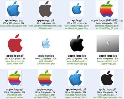
In other words…can Nike or Apple take liberties that a lesser known company can't afford to take or doesn't it matter?

![Reblog this post [with Zemanta]](http://img.zemanta.com/reblog_e.png?x-id=482decb5-080e-4df9-b579-6f1f36cb86b7)