Where does your brand live?

August 30, 2011
112039832
…How does your brand come alive?

When we talk about a company’s brand, in most cases people’s minds jump immediately to their logo.  No argument – a logo is a vital element of how you communicate it.  It is the visual representation of who and what you are.  But your logo is just the beginning of it.

Others might point to your tagline and suggest that’s where your brand lives.  Again, it’s an important communication tool for telling people what your company is all about.  But where both your logo and your tagline fall short is that they’re one-way communications.  You are showing or telling, but your audience is not actually experiencing your brand.

Brands really come to life when an experience confirms or amplifies the promise that your logo and/or tagline might offer.  Here are some key spots that you might not think about from a brand point of view.  But, they’re places where you can truly bring it to life for your employees, customers and vendors.

Your office/work space: You know what they say about first impressions.  One spot where many first impressions are created is when someone comes to see you for the first time.  Whether you have a retail space, office space or work virtually through an extranet —  how it first appears to your audience will stick for a long time.

  • Does it feel very corporate and official?
  • Is it welcoming and kind of funky?
  • Could it be called cluttered or filled with interesting items?
  • How about neat, with everything in its place?

All of that speaks to your brand and what matters to you.

Your “first day at work” experience: Never forget, your most active and important advocates are your employees.  And for them, there are few days more memorable than their first day at work.  What is that day like for them?

  • Are they assigned a buddy who helps them get oriented to your workplace, the people and the procedures?
  • Is there a small gift (maybe a hat with your company logo on it) waiting for them at their new desk?
  • Do some of their teammates take them out to lunch?
  • Are they given training or is it a baptism by fire?
  • Is everything ready for their arrival or are you scrambling to get paperwork and supplies to them?

Think how many people are going to ask them “how was your first day?”  From a brand perspective, what do you want their answer to be?

Your “return” policy: Even if you are a corporate lawyer, you have your own version of a return policy.  How do you handle an unhappy client?  What do you have in place to avoid making them unhappy in the first place?

  • Do you have a guarantee tied to your pricing or billing?
  • Do you have a confidential way for them to register a complaint?
  • Do you offer refunds without restrictions, boundaries or tiny type?
  • Do you have an apology gift or letter that is ready to go in the case of a hiccup?

Remember that an unhappy customer is likely to tell more than twenty people why they’re unhappy.  Do you have policies and procedures in place so that your brand comes out smelling like a rose when those stories get told?

Just like everything in else in life – we can talk all we want, but it is our actions that really tell the story.  How you wrap your brand around key experiences like those first impressions, the first day of work and when things go wrong will go much further in terms of creating a lasting brand.

So where do you think your brand is most alive and vibrant?


Enhanced by Zemanta
More

Smart logos

June 21, 2011

I can’t draw a stick person by hand or on the computer.  So I have always marveled at people who can really take design to a different level and go beyond pretty/cool to smart.  That’s what brilliant logo designers do.

I thought you’d enjoy checking out some of these very smart logo designs.

Image

If you look at the center of this logo, you can see two people enjoying a Tostito chip with a bowl of salsa. Great logos often have layers to them.

fedex logo
Like the FedEx logo.  Do you see the “hidden” arrow within the logo?  Look at the space between the E and the x.

Image6

This is the new Baskin Robbins logo.  The old one had the number 31 with an arc above it. See how they’ve incorporated the 31 in the new design?

Image1

See the number 1 in the negative space between the F and the red stripes? Notice how the red section communicates a feeling of speed.

Image2

By now, you should be getting good at spotting the layers.  Do you see the M and the B?

Image4

Two elements to notice in this simple logo.  The yellow arrow connects the A to the Z (we have everything from A-Z) and forms a smile, to connote a commitment to customer service.

Image5

Toblerone is a chocolate company from Bern, Switzerland which is sometimes called The City Of Bears.  Do you see the silhouette of a bear?

Okay…here are three for you to discover on your own.

birdlove
invisible
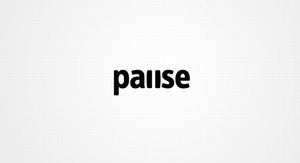
pause

My point?  There are plenty of companies and websites that can whip up a logo.  And some of them go beyond the trite and expected.  But don’t settle for okay.  Your company deserves better than okay.

If you loved these and want some more…check out these logos.

Hat tip to my dad and Mike Colwell for sharing some of these logos with me.


Enhanced by Zemanta
More

Your logo is a business tool

March 28, 2011

78482601
Your logo is a tool, not art

We were sitting in the conference room the other day with a new client.  He’s been in business for many years and is very successful.  He’s ready to reallyramp up his marketing and tackle some lofty goals.

And we’re ready to help. (After all, that’s what we do)

He went on to tell us that he really doesn’t like his logo.  It doesn’t tell his company’s story very well, it’s a little expected and in his opinion, it isn’t very attractive.  So the first project he’d like us to launch is a logo re-design.

I took a deep breath and told him no.

Now… granted I said it with more words…and nicer.  But basically I said this:

  • No logo is going to tell the whole story of your business
  • You have over a decade of equity in your current logo
  • Your current logo isn’t costing you any customers or any money (no one’s not choosing you because of your logo)
  • Your current logo is fine.  It’s not perfect and we’d be able to come up with something better.  But not so much better that it will line your pockets.
  • Remember a logo cost is far beyond just the cost of designing a new logo.  There are legal costs to register it, you have to re-print all of your business cards, letterhead, etc., your staff’s uniforms would need to be changed and your trucks would need to be re-vinyled.  Then, there’s building signage etc, etc. etc.

I summed it up with… if the only reason you want to change your logo is because you don’t like it, it’s not a good enough reason.  It’s not a piece of art you choose to put in your home, it is a business tool and your current logo is doing the job adequately.

I also told him, it was his company.  And if he hated the logo that much and he gritted his teeth every day when he saw it and it haunted him in his dreams — we’d design him a new logo.  But that if it was my money — I wouldn’t spend it there.

Do not get me wrong.  A logo is a very important part of your marketing effort.  Most logos suck and should be changed.  But his didn’t.  And it shouldn’t be changed for the subjective reason of his personal taste.

Your logo is a business tool.  If it’s doing a good job — leave it be.


Enhanced by Zemanta
More