Smart logos
June 21, 2011
I can’t draw a stick person by hand or on the computer. So I have always marveled at people who can really take design to a different level and go beyond pretty/cool to smart. That’s what brilliant logo designers do.
I thought you’d enjoy checking out some of these very smart logo designs.

If you look at the center of this logo, you can see two people enjoying a Tostito chip with a bowl of salsa. Great logos often have layers to them.
![]()
Like the FedEx logo. Do you see the “hidden” arrow within the logo? Look at the space between the E and the x.
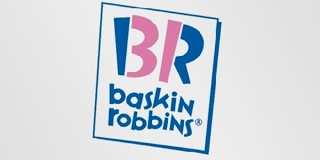
This is the new Baskin Robbins logo. The old one had the number 31 with an arc above it. See how they’ve incorporated the 31 in the new design?

See the number 1 in the negative space between the F and the red stripes? Notice how the red section communicates a feeling of speed.
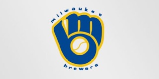
By now, you should be getting good at spotting the layers. Do you see the M and the B?

Two elements to notice in this simple logo. The yellow arrow connects the A to the Z (we have everything from A-Z) and forms a smile, to connote a commitment to customer service.
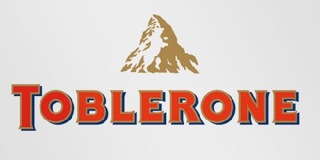
Toblerone is a chocolate company from Bern, Switzerland which is sometimes called The City Of Bears. Do you see the silhouette of a bear?
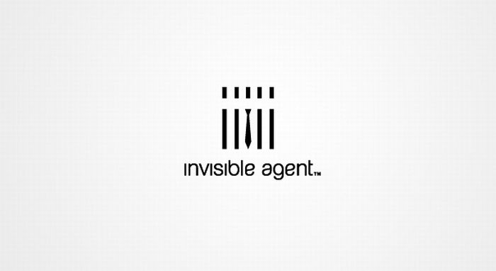
Okay…here are three for you to discover on your own.
My point? There are plenty of companies and websites that can whip up a logo. And some of them go beyond the trite and expected. But don’t settle for okay. Your company deserves better than okay.
If you loved these and want some more…check out these logos.
Hat tip to my dad and Mike Colwell for sharing some of these logos with me.
