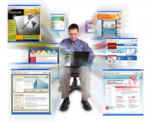
Is it time for a website re-design?

June 18, 2013

WebsiteDesignIn today’s marketplace, a company’s website is their first impression with prospects. It’s a rare purchase today that doesn’t begin with some sort of research or due diligence. And as consumers (both B2C and B2B) find themselves more time starved and more web savvy – the research tool of choice is often a Google search.

Long before they’ll set an appointment for a consultation or walk into your retail establishment – they’re scoping you out on the web. It makes sense then, that when it comes to your web presence you’d want to put your best foot forward, doesn’t it?

And yet, if you spend any time on the web – you run into a lot of stale, outdated websites. We just launched a new website for a client and his comment was “phew, now I can actually give people our web address again.” They’d ignored their website for so long – they literally weren’t giving people the URL to avoid embarrassment.

When asked, companies say that they don’t update their website because:

  • They don’t have the time to devote to it
  • They don’t have the budget
  • They don’t want to add interactive elements because they don’t have time to maintain them
  • The last redesign was such a painful process, they can’t think of going there again

But letting a stale or static website be your first “how do” to potential customers is more costly than you might imagine.

If you’ve got dated copy or information (many websites make it pretty obvious they haven’t been updated in years…their latest newsletter issue is from 2008 or the last bit of news in their newsroom is from three years ago) what you’re saying to visitors is that you aren’t so hot will follow up and attention to detail.

If your design is tough to navigate (you know…you just keep adding a page here or there, but there’s no organizational structure) you are going to frustrate that potential customer before they can figure out if you have what they want to buy.

Cheaping out by letting your cousin, neighbor or other amateur build your website says that you aren’t a successful business. You don’t have to build the Taj Mahal of websites but you do want something that speaks to your professionalism and functions the way you want it to.

Are you wondering if your website is working as hard for you as it should? See how your site matches up with these stats.

Websites with blogs get 55% more traffic (Are you sharing your expertise and taking advantage of the organic SEO value of that effort?)

Companies who blog get 79% more followers on Twitter (How does your stale website encourage me to connect with you on social networks like Facebook, Twitter and other interactive spots?)

The #1 attribute people want is a websites that is easy to navigate so they can quickly find the exact information they want. They don’t want to have to click 4 times or guess which heading the information is hiding behind.

People want contact information so they can call, write or drop by. This floors me but many companies do not include offline contact options to their web visitors.

Keep the distractions at a minimum. People want to be able to scan your page and figure out what’s there and where to go next. If you pack every bit of space with information, you actually get in their way. Remember, your goal is not to tell them everything so they don’t have to call. Your goal is to tell them enough to make them want to call.

Your website is your introduction to many of your potential customers Is it the way you want to be introduced or is it time to consider a re-do?


Enhanced by Zemanta
More

Smart logos

June 21, 2011

I can’t draw a stick person by hand or on the computer.  So I have always marveled at people who can really take design to a different level and go beyond pretty/cool to smart.  That’s what brilliant logo designers do.

I thought you’d enjoy checking out some of these very smart logo designs.

Image

If you look at the center of this logo, you can see two people enjoying a Tostito chip with a bowl of salsa. Great logos often have layers to them.

fedex logo
Like the FedEx logo.  Do you see the “hidden” arrow within the logo?  Look at the space between the E and the x.

Image6

This is the new Baskin Robbins logo.  The old one had the number 31 with an arc above it. See how they’ve incorporated the 31 in the new design?

Image1

See the number 1 in the negative space between the F and the red stripes? Notice how the red section communicates a feeling of speed.

Image2

By now, you should be getting good at spotting the layers.  Do you see the M and the B?

Image4

Two elements to notice in this simple logo.  The yellow arrow connects the A to the Z (we have everything from A-Z) and forms a smile, to connote a commitment to customer service.

Image5

Toblerone is a chocolate company from Bern, Switzerland which is sometimes called The City Of Bears.  Do you see the silhouette of a bear?

Okay…here are three for you to discover on your own.

birdlove
invisible
pause

My point?  There are plenty of companies and websites that can whip up a logo.  And some of them go beyond the trite and expected.  But don’t settle for okay.  Your company deserves better than okay.

If you loved these and want some more…check out these logos.

Hat tip to my dad and Mike Colwell for sharing some of these logos with me.


Enhanced by Zemanta
More

Your logo is a business tool

March 28, 2011

78482601
Your logo is a tool, not art

We were sitting in the conference room the other day with a new client.  He’s been in business for many years and is very successful.  He’s ready to reallyramp up his marketing and tackle some lofty goals.

And we’re ready to help. (After all, that’s what we do)

He went on to tell us that he really doesn’t like his logo.  It doesn’t tell his company’s story very well, it’s a little expected and in his opinion, it isn’t very attractive.  So the first project he’d like us to launch is a logo re-design.

I took a deep breath and told him no.

Now… granted I said it with more words…and nicer.  But basically I said this:

  • No logo is going to tell the whole story of your business
  • You have over a decade of equity in your current logo
  • Your current logo isn’t costing you any customers or any money (no one’s not choosing you because of your logo)
  • Your current logo is fine.  It’s not perfect and we’d be able to come up with something better.  But not so much better that it will line your pockets.
  • Remember a logo cost is far beyond just the cost of designing a new logo.  There are legal costs to register it, you have to re-print all of your business cards, letterhead, etc., your staff’s uniforms would need to be changed and your trucks would need to be re-vinyled.  Then, there’s building signage etc, etc. etc.

I summed it up with… if the only reason you want to change your logo is because you don’t like it, it’s not a good enough reason.  It’s not a piece of art you choose to put in your home, it is a business tool and your current logo is doing the job adequately.

I also told him, it was his company.  And if he hated the logo that much and he gritted his teeth every day when he saw it and it haunted him in his dreams — we’d design him a new logo.  But that if it was my money — I wouldn’t spend it there.

Do not get me wrong.  A logo is a very important part of your marketing effort.  Most logos suck and should be changed.  But his didn’t.  And it shouldn’t be changed for the subjective reason of his personal taste.

Your logo is a business tool.  If it’s doing a good job — leave it be.


Enhanced by Zemanta
More

Visual creativity

March 2, 2011

Last week, we talked about how we keep our brains firing and stay creative.  Many people offered the tip of reading and absorbing other people’s smart work.  That goes for design work as well — whether you are a writer or artist.

One of the best examples of outdoor creative is this brilliant outdoor campaign. Along the “outdoor” theme…here are some very clever and compelling visuals applied to public spaces/buildings.

Spark any ideas?

creative building ads 01
Coop’s Paints/Nationwide Insurance
creative building ads 05
AllState Insurance
creative building ads 10
Anando Milk

If you enjoyed these…check out all 20 of them by clicking here.

Hat tip to Mike Colwell for sharing this link with me.

Enhanced by Zemanta
More