The eyes have it – Infographics

September 5, 2018

infographicsWe’re knee deep into a series that is focused on helping you plan for 2019 by identifying the channels too critical for you to ignore. Today, we’re going to investigate the value of infographics.

Visual content works. Consider these facts:

  • The human brain processes visual content 60,000 times faster than it does text.
  • Infographics are liked and shared on social media three times more than any other type of content.
  • High-quality infographics are thirty times more likely to be read than text articles.

An infographic allows you to communicate complex ideas in an easy to understand format. They make it easy to show the relationship between various elements so your audience can see the bigger picture.

You can deliver more information because the format itself is simple, clean and holistic in how it presents your ideas. If your audience needs to understand how one fact or choice impacts other elements – an infographic may be the right choice. If you know that your audience is faced with multiple options, help them follow the path to the outcomes tied to each decision.

Infographics are also a smart option for telling a linear story and showing the flow of events in a relational way. Think of it like a storyboard that outlines the key events or milestones. You can use colors and design choices to suggest emotions behind the facts and set a tone for the entire discussion.

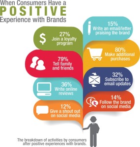
For those of you that invest in research, be it a customer satisfaction survey or actually going out into the field and doing primary research, consider using an infographic to communicate the most important findings. You will enjoy the increased distribution that infographics garner and you’ll be able to connect the dots for your audience.

Infographics are incredibly effective when you need to communicate the facts underneath an emotional issue. By using graphics, facts and building the story to show multiple sides of an issue, you can help your audience separate their sentiments and examine the data so they can make an informed, fact-based decision.

As you might imagine, infographics are a no-brainer when you need to demonstrate something visually. Whether it’s a spatial relationship or a comparative that is tied to how the elements look, you need to show it, and an infographic gives you that ability.

If you’re going to jump on the infographic bandwagon, there are some best practices you need to keep top of mind.

Be mindful of your audience. Think about your color, font and graphic style decisions based on who you’re talking to. You also need to think about your own brand standards and make sure that you don’t violate those boundaries.

Be mindful of the size. Remember, you’re going to be sharing this on your website and social channels. A file that is too wide or too long will either display badly (or not at all) or discourage people from passing it along.

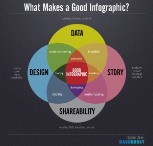
Remember that color and fonts are critical tools. This isn’t just about the colors or fonts that your designer likes or even your own brand standards. The color palette and font choices within your infographic are all about making your information easier to consume. Be mindful of color contrasts and font legibility and how they help tell your story.

Infographics offer marketers a fresh way to share the complex, demonstrate connections and make a compelling case that would normally be dry and less interesting. Think about how you’re communicating some of your more complicated messages and explore whether a visual representation would make it more compelling and easier to understand. Infographics probably aren’t going to be the staple of your 2019 marketing toolkit, but they should probably be one of the supporting elements.


More

6 steps to creating an effective infographic

September 29, 2015

6 steps to creating an effective infographic

There’s no doubt that infographics are an influential element of today’s marketing landscape. They take advantage of your audience’s ability to process visual information quickly and to retain the key facts long after the words have faded.

You can use infographics to:

  • Tell a story
  • Weave in insightful data
  • Build your brand
  • Increase SEO through easy sharing
  • Increase your credibility

But before do all of those things, you have to actually create the infographic. Here are 6 steps to creating an effective infographic — so you can begin to reap the benefits.

1) Create an outline: Even though you’re going to be telling the story through visuals, graphs, and data – it is still all about telling a story. Like all good stories, it needs to flow in a way that helps your audience understand it.

Identify the key messages you want to communicate and give some thought to the sequence of how you’d like to present the data.   You’ll want to build up to your conclusion appropriately.

2) Do your research: Accurate facts, statistics and credible sources are all key to building a valuable infographic that can create buzz for you and your business. This isn’t the place to approximate or guess. Remember that the data is the core of your story. It creates the interest and is your main tool for providing insight. So don’t skimp here. Take the time to really dig deep.

Be sure you provide reference links (typically at the bottom of the infographic) to document your data sources.

3) Take time with the title: An infographic’s title is in essence a headline and deserves the same time and attention as if you were creating a print ad. If the title doesn’t grab your audience then it’s pretty tough to lure them into the content.

Advertising legend David Ogilvy knew the power of headlines, and proved time and time again that the headline determined whether an ad would get read. He rewrote his famous headline for a car ad over 100 times before being content with “At 60 miles an hour, the only thing you hear in the new Rolls Royce is the ticking of the dashboard clock …”

Be as diligent as David Ogilvy and create a headline that does the heavy lifting.

4) Paint the picture: I hate to state the obvious but what makes your infographic work is how it looks. Too many visuals, clichéd images or a lack of organization in the storytelling means that all you’re going to get is a glance.

The images you use should frame the story and the data fills in the details. At each stage of your story, use an image to anchor and explain that particular section. Be mindful of your color scheme as well. Choose a palate that will make the data pop, and make your infographic stand out in the sea of competitors.

5) Draw conclusions: A good infographic doesn’t just present facts. It combines those facts, trends and other information to help people see the connections. In a world where we are overrun with information, we’re still starving for meaning. Your infographic should illuminate and connect the dots for the audience.

Think of your infographic as a snapshot that helps someone get the big picture and then, if they want to, they can drill down into your specific data and even check out your sources for the nitty-gritty if they want to.

6) Finish right: Just a few things to make sure you keep in mind. Always include your own URL on the infographic so you get credit for creating it. Be sure to make it easy to share on all the social networks and if you can, offer embed codes so people can post it on their own websites and blogs.

More

Best practices for creating infographics

September 14, 2015

best practices for creating infographicsWhether you know what they’re called or not, we all consume infographics every day but when it comes to using them to market your own business — what are the best practices for creating infographics?

Most people are a combination of visual, auditory and kinesthetic learners and about 65% of us are mainly visual learners. Visual learners easily pick up information with their eyes. Visual learners often associate the things they learn with the images they saw when they first learned the material.

Why are so many of us visual by nature? The brain processes visual information more quickly than text and it retains more of that information. 90% of information transmitted to the brain is visual and visuals are processed 60,000 times faster in the brain than text.

Back in the good old days of marketing, we used to (and really still do) talk about white space and using fewer words and more graphs, charts and pictures to tell a story. So it shouldn’t surprise any of us that infographics are here to stay.

Infographics take full advantage of the brain’s power to absorb images, which allows the viewer to capitalize on the advantages visuals can have over text.

I’m sure you’ve seen one but just in case — an infographic is a visual representation of information, data and knowledge that is intended to quickly and clearly communicate complex data. It might include maps, charts, diagrams, lists or graphs and usually is a combination of these.

They’re basically a very visually interesting way to tell a story conveying accurate information and data but in a visual form that allows us to get the gist of the message quickly. Think of them as a snapshot of complex data that is easy to read and easy to share in a short amount of time.

They also generate lots of web traffic and for many companies have become valuable marketing tools.

There are many elements to a creative, successful, attention-grabbing infographic. They’re essentially stories containing accurate content, controllable design, easy integration and versatility – all advantages from which marketers can benefit.

Thinking about infusing infographics into your marketing? Here are some things to keep in mind:

Tell A Story: An infographic conveys a story or message as a visual sequence. The creative use of graphics helps people to understand the message or story being delivered and increases retention.

Incorporate Insightful Data: A key element of most infographics is statistical data. Viewers are drawn to statistics so make sure they’re accurate. A single inaccurate statistic will damage the credibility of the entire piece and worse — your company.

A Brand Builder: Infographics are great for creating brand awareness, so be sure it accurately reflects your brand. Your graphics should inviting viewers to investigate your website or company a little more. Be sure you have content to satisfy their interest when they get to your website.

Another benefit of this tool is brand recall. Readers of the infographic are not only more aware of your brand but will also recall it better, which may help influence decision-maker purchase consideration. Research shows that the action of sharing increases brand recall by 63%.

Make It Easy to Share: These visual tools are easily shared on websites, blogs and social networks. Make sure you give people a way to embed your infographic to generate more traffic, views and shares. A strong effort will earn your site a lot of inbound links and give you a big SEO boost.

Credibility: Through the use of accurate data, statistics, insights and references, your infographic builds credibility and demonstrates your expertise in a very unique way. It not only uses a variety of statistics and facts to reduce a complex data set to a manageable and eye catching visual representation – but it also enhances your reputation as a thought leader.

As you begin (or continue) to work on using visuals in your marketing efforts be sure you bake in these best practices for creating infographics so you maximize the incredible benefits of this communications tool.  For some more examples — check out these 11 infographics on what makes a good infographic!

More

Search versus Social – which one wins?

September 29, 2012

If you’re wondering which is more potent — search or social media — as is often my answer — it depends.

The truth of the matter is that every organization should be thinking about BOTH because they are the yin and yang for each other.  Each feeds the other side of the equation.  When you write quality content about topics that your audience cares about (social) you attract readers, shares and you earn social proof of your expertise.

That content then begins to influence search for those key words and phrases that exist within your subject area and content (Search) and before you know it, you’re impacting Google and the other search engines — becoming more findable and attracting exactly the right people to your content.

Yin. Yang. The perfect combo. This infographic, developed by MDG Advertising really makes the point.  And should be hanging in your office to remind you to go for the one two punch of social AND search.


(Click here to download the full-sized version)

Enhanced by Zemanta
More